
The Best-Designed Kits of the 2026 FIFA World Cup
From Curaçao’s butter-yellow away shirt to Ghana’s artist-led Puma kit, the 2026 World Cup is already a fashion tournament. And I’m seated.
We are exactly one week away from the 2026 World Cup kicking off across the US, Canada, and Mexico, which means it is time to return to the power rankings of the FIFA kits and my favorite intersection of fashion and soccer.
A lot has changed since the last World Cup in 2022 (peep my ranking from 2022). Athletes are not just wearing fashion now. They are driving it. Tunnel walks have become runways, jerseys have become styling objects, and fans are cutting, cropping, collecting, and reselling shirts with the same intensity once reserved for sneakers or handbags. Football journalist Joey D’Urso has a new book, More Than A Shirt, that looks at kits as windows into money, politics, and power. Hoping to read it during this World Cup season as the premise feels exactly right for this moment.
All that to say these kits have earned their place as cultural objects.
The 2026 tournament is the first 48-team expansion, which means more federations on the design board than ever before, and the spread between who showed up with real design intent and who phoned in a refreshed template is wider than I expected.
6. Exploring National Heritage: South Korea (Away) / Nike

Nike is clearly treating Korea like one of its top creative priorities this cycle. The colorway is “Space Purple” with an all-over floral graphic inspired by traditional Korean art and the Mugunghwa national flower. The theme across the Home and Away kit was to take heritage motifs (the Home jersey draws from the symbolism of the white tiger), flipped into something bold and streetwear-aware. Shop it here (currently sold out with restock planned soon).
Choosing purple for a national team away is a real risk (and has divided fans), but it works because everything Korea touches culturally right now lands. K-pop, K-beauty, K-skincare, K-dramas, K-pop Demon Hunters (an enduring fit aesthetic in my daughter’s world). This jersey is honestly a better K-statement to bring to your next birthday party than another Demon Hunters fit, and it has the design depth of a shirt you can wear past the tournament. Love the styling inspiration from Megan Reyes above.
5. The Threat of Joy: Brazil (Away) / Jordan Brand

Brazil’s away is the first World Cup kit ever made under the Jordan Brand umbrella. The concept is “Alegria Que Apavora” (The Threat of Joy) with colors pulled from the poison dart frog of the Amazon, with the Air Jordan 3 elephant-print texture worked into the construction. Royal blue base, black accents, a Jordan-specific build that photographs differently than a standard Nike Brazil shirt would. Shop it here (smaller sizes sold out).

The other Brazil story worth knowing. Neymar made the squad. After everything (the ACL, the long road back, the question of whether he’d even physically be there), he’s playing. That’s its own kind of joy that threatens. The kit feels like it was made for that moment.
4. Surrealism Takes Center Stage: Belgium (Away) / Adidas

Belgium’s away by Adidas is “Frozen Blue” with carbon, white, and light pink accents, and the joke is in the neck print: “Ceci n’est pas un maillot” (“This is not a shirt”). It is a tribute to the Surrealist Belgian artist, René Magritte, and his work The Treachery of Images with the script: Ceci n’est pas une pipe (“This is not a pipe”). During its launch, the Belgian soccer federation shared, “True to the surrealism theme, the kit sparks the imagination and invites conversation.” The Belgian artist questions the relationship of mind and eye, reality and language - love the depth of this work and excited to see it live. Shop it here.

3. All in the Details: Morocco (Home) / Puma

Morocco’s home kit by Puma reads quieter on first glance than the 2022 jersey that ended up everywhere. Deep red, green side panels, traditional Moroccan embroidery patterns referenced at the collar and cuffs. The collar detail is what holds it. Actual embroidery references from Moroccan craft heritage worn into a contemporary football shirt without being precious about it. It is the perfect balance of thoughtful borders, collars, and emblem without screaming MOROCCO. My favorite type of aesthetic. Shop it here.

The Morocco storyline is also a personal one for me. In 2022 Morocco beat Spain on penalties in the round of 16 and I watched crying. They went on to beat Portugal 1-0 in the quarters, and made it all the way to the semifinal - the first African team ever to do so. So to say I am rooting for them is an understatement.
2. Color as a National Language: Ghana (Away) / Puma

Ghana’s away kit is “Sunny Yellow” with market-stall color blocking referencing the textile and food stalls of Accra’s Makola Market. A red crew neck collar is combined with a green back neckline, reflecting colors from the national flag. A large black star sits centrally on the front, referencing the national symbol. A small Ghana flag is placed on the upper back below the collar. This jersey is sold out, but you can see the rest of the kit here.
.")
The bigger story is the creative direction credit: Prince Gyasi, the Ghanaian visual artist known for hyper-saturated photographs. Gyasi has synesthesia, a condition that overlaps the senses in unusual ways. In his work above, The Last One, pink becomes a field of hope. For Gyasi, yellow carries the warmth and energy that define Ghana, which makes his role in this kit feel especially fitting.
1. The Kit Waiting for Its Moment: Curaçao (Away) / Adidas

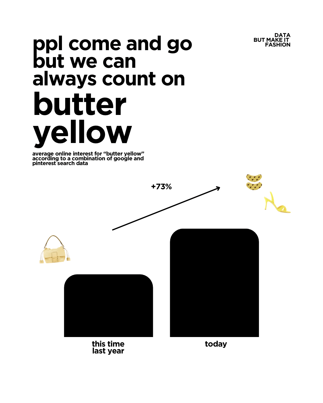
Butter yellow has been trendy for a few years and every summer it pops again (Hermès just did their show in LA with a full butter yellow set). The team that nailed it is the team you might not have known qualified. Curaçao, a Caribbean island nation of 155,000 people, currently FIFA ranked No. 82, is in their first World Cup ever, courtesy of the 48-team expansion. Their away kit is a soft pastel yellow with pink, turquoise, and orange stripes that, per Adidas, “celebrates the capital city Willemstad and the colorful buildings that reside in its Punda and Otrobanda districts.” Anyone who has seen the colonial-era pastel facades along the Sint Anna Bay knows exactly what they’re referencing. It’s a UNESCO Heritage waterfront in shirt form.
The kit sold out in six of seven sizes on the Adidas US site within weeks of release. Adidas has confirmed a restock for later this summer. Football media has been quietly treating it as a design win all spring.

Here’s the cruel twist. Per the FIFA group-stage color designations guide released in late May, Curaçao is scheduled to wear their HOME shirt for all three of their Group E matches. Which means unless Curaçao advances to the knockout round, the most popular away kit of the cycle may never actually appear at the World Cup.
That’s a fitting climax to this list, somehow. The kit that lands hardest is the kit that may never be played in. Football fashion and football itself have always been only loosely related, and Curaçao clearly demonstrates that gap.
The tournament has not even started yet, and the shirts are already doing what good design does best: telling us who wants to be seen, what stories they want to carry, and what gets left just outside the frame.
I’ll be dropping more of my favorite collabs (there. are. so. many.), storylines, and styling ideas over the next few weeks. And of course, my favorite USA jerseys, the only ones I’ve actually bought so far. Stay tuned for more.
Cover image via GQ.
Note: This post contains some affiliate links, so if you choose to purchase something via a link with an affiliate fee I make a small commission at no cost to you