


The Art of Framing
How I use mats, float mounts, and frames to shape the story of a piece

In film, they say there are three versions of every story: the one the writer imagines, the one the director shoots, and the one the editor shapes. Each layer adds perspective, and by the end, the story has evolved into something new.
Hanging art at home feels a lot like that. The artist makes the piece, you choose the frame, and the context of where and how it lives shapes the experience. Each layer tells a new part of the story.
Today I want to focus on framing and how it is one of the simplest ways to transform your art and space. Over time, I’ve found myself returning to a few principles that help me frame with more intention and clarity.
Four Principles of Framing
Start with the Mat
Mats don’t just separate art from the frame, they anchor the work and create breathing space. Especially if you’re framing non-traditional art, like poems, cards, receipts, or newspapers, a mat signals that it deserves a place on your wall.
I usually begin by considering whether the piece needs a mat, and if so, how it should interact with the art. Color, texture, and proportion are where the personality comes in.
I recently purchased a limited edition Alec Egan print, Night Setting. I used a classic white mat and a slim wood frame to give it room to breathe. Egan’s art is a series of stories from different rooms in the home. He had a show prepped for earlier this year and lost all of his work, including his studio and home, in the Palisades fire. I wanted to honor his art and story with a mat that didn’t compete. It just gave it a little dignity and structure to let Egan’s art shine.

Play with Material
The material of the mat and frame can reinforce or create interesting tension with the subject and details of the art. Consider the materials used by the artist, what’s already in your space, and the emotional tone of the piece. Generally, organic materials pair well with wood frames, and modern works of art often shine in metal. But like fashion’s “wrong shoe theory,” sometimes contrast is what makes the whole thing sing.
A small vintage still life in a monochrome red mat and lacquered frame? That kind of friction can completely reframe the art and push it to feel more modern and elevated, rather than old fashioned and fussy.
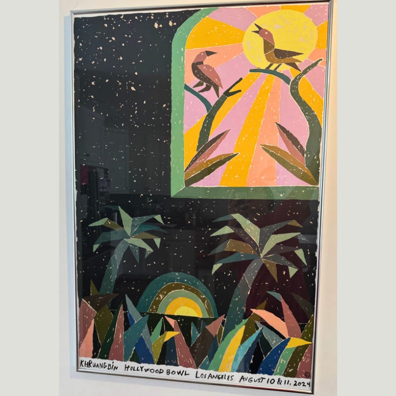
It’s full of energy and memory, from one of our favorite concerts with friends. Seeing it while cooking or walking in the door brings that joy into the everyday. The chrome echoes light fixtures and a candlestick holder nearby, subtly tying the space together.
In our entryway, I chose a thin chrome frame for a Khruangbin x Abel Macias poster. This piece is filled with energy and memory one of our favorite concerts last summer. Seeing it while cooking or walking in the door bring that joy into the everyday. I love starting the morning or shifting into my evening routine with the energy it seems to emanate. The frame, echoes the chrome light fixtures and a candlestick holder nearby, subtly tying the space together.
Near my desk, I have a piece by Ragni Agarwal, The Yin to My Yang, which draws on Indian textiles and print motifs. I chose a black velvet mat to echo the richness of the materials in the art and highlight the bright palette. I paired it with a stepped gold frame whose layered profile mirrors the jewelry worn by the women in the piece. I love how Ragni’s work is rooted in Indian American experiences, and playing with the way I framed it helped reinforce those stories.

How Ragni Agarwal Found Hope and Healing Through Her Art

Ragni Agarwal is an Indian-American artist based in Los Angeles. Her vibrant pieces, feature confident, graceful women, and act as love letters to the women who helped her survive. "I wouldn't be around if it wasn't for them," shared Agarwal when we met at
Let the Edges Shine
Deckled paper, stitched fabric, or uneven prints can all benefit from being float-mounted to reveal their edges. These pieces add dimension and depth to your walls. That doesn’t mean you have to float everything. If the edges distract from the context, or if you want the piece to feel more grounded, a mat might be the better choice.
For a handmade amate paper work from Mexico, I chose a float mount to emphasize the paper’s raw edge and textured surface. It added shadow, movement, and a bit of reverence for a piece I bought in a market stall from a vendor who shared that his wife had made the piece. All the pieces were dyed with natural materials like cochineal and flowers. I love how this piece now has the reverence it deserves (And yes, the framing was more expensive than the art).

In contrast, a watercolor piece by Vanessa Valero, on unbleached fabric with raw edges. Valero, a Colombian artist, made this piece while at an artist residency in my dad’s hometown of Ahmedabad in India, a connection which I loved. The piece could have been floated, but I opted for a linen mat and traditional mount. That choice grounded the work in the living room and allowed it to feel core to the space rather than incidental.

Interview: Textile Artist Vanessa Valero

At the Other Art Fair in Los Angeles this past fall, a beautiful woven tapestry of the mountains stopped in my tracks. The depth of colors and textures was unlike other pieces I had seen. I went around the corner and found an equally mesmerizing set of work, but in a completely different format - watercolors of p…
Two unfinished materials. Two different framing decisions. There truly aren’t rules to follow here, but rather an opportunity to the read the piece, the room, and story you want to tell.
Canvas lives in this world too. If the edges feel complete or painterly, sometimes it’s best to leave them exposed. Other times, a float frame adds just enough structure without losing the artwork’s rawness. I recently float-framed two canvases for a client’s formal living room. The warmth of the wood and scale of the frame helped the art feel settled and elevated in a more polished setting. Trust your eye

Proportion Play
When in doubt, don’t go too matchy. A thick mat with a thin frame (or vice versa) creates visual tension that helps focus the eye on the art. Contrast in scale, tone, or finish, is often what makes the whole piece feel alive in the room.
One of the most striking examples of how proportion shapes perception is Sāmanjasya (Harmony) by Devika Tandon of Motherland Designs. The work is mesmerizing—an intricate black-and-white composition that references Indian motifs and traditional henna patterns that feels like the definition of controlled chaos. To focus the work, I opted for a thick white mat that creates space and pause, allowing the eye to slowly take in the detail. The slim black frame brings clarity and contrast, anchoring the piece without overwhelming it.

Another favorite example is Night Palette by Maria Dalli. It’s medium-sized and float-mounted inside a wide mat and framed in gold. This was the first original artwork I bought for our home, and I wanted the framing to reflect its importance. That small shift in proportion gives a quiet piece a sense of presence.

***
Framing is where your voice enters the conversation between the artist and the space. It’s a subtle but powerful way to shape how art lives in your home. How the piece looks, feels, what it remembers, and what it evokes each day.
You don’t need a gallery wall or a big budget. Just one piece and a little attention to how it’s framed can change the rhythm of a room. If there’s something sitting in a drawer or leaning against a wall, maybe this is your sign.
And of course, if you are looking for help with understanding your style, sourcing art, or commissioning pieces, reach out! You can also set up time with me here. Can’t wait to find you the perfect pieces that tell your story.
This is an interesting analogy you make to film: "The artist makes the piece, you choose the frame, and the context of where and how it lives shapes the experience." Noodling on this as I revisit art I already have up in my home.
Also helpful to think about not going too matchy. Thank you!